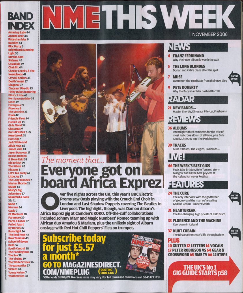
This contents page is structured so that there is a lot going on for the audience to be interested in. The main and only photograph on the contents page is a photograph of a band which are featured in the magazine as being the biggest sell line. Because the picture is the only picture on the contents page, it informs the reader that this band are going to be featured in the rest of the magazine. The list at the left side is a list of other bands that are also featured in the magazine. It is good to have this list because it informs the audience of other bands that feature in the magazine. If someone reads the list and notices that one of their favourite bands is mentioned, they are more likely to buy the magazine. Having the same three colours, red, grey and black make the layout look more professional. However, at the bottom, there is an advertisement to subscribe to the magazine monthly. This text is yellow and therefore stands out from the rest of the colours on the contents page. Because the background is very light grey, a black box has been placed around this advertisement so it is easy to read. The biggest text on the page is 'NME this week.' This is so the reader is fully aware that this is NME magazine, and that the following information is in this weeks magazine. This also has a black box around it to stand out from the rest of the page. The actual text of the contents page is at the right side. There are subheadings which are bold with a black box so that it is clear to the audience what is going to appear in the magazine. Under the subheadings are the page numbers and titles.
No comments:
Post a Comment