Since I have started this course around six months ago, I have completed my preliminary task, my flat plan rationale, analysis of magazine covers, and the redraft of my contents and front cover. I have also completed my magazine cover and contents page and I am currently working on my double page spread. I have posted a blog update on January 31st , and I posted updates for my magazine cover and contents page. Overall I think I have managed my time effectively and I will continue to do so.
Friday, 30 November 2012
Thursday, 29 November 2012
Contents Page Draft

This is my completed contents page. I have used my own images that I have taken at various concerts and I have put them in my contents page. I also have the magazine advertised at the top corner along with a quote from a celebrity from the magazine. My contents list is at the side and I have used sub-titles and bold fonts to make them stand out. I have also used a bold font for the page numbers so that the audience can easily find what they are looking for. It has taken me two lessons to complete this task which means I am working at a good pace and my time management is good. I am now ready to start planning my double page spread.
Sunday, 18 November 2012
Contents Page 3 Analysis

This contents page is very different from the second contents page that I analysed. The second contents page has a lot going on, whereas this contents page is simple. The pros of this page being simple is that the audience can easily find anything they may be looking for. The main sell line is an interview with Bon Jovi, and this is why the biggest photograph is a photograph of one of the band members. Near his photograph, there is the page number for the interview so the audience can easily find it. At the left side is the contents with the sub headings and the page numbers. The text is black and easy to read and has it's own part of the page and doesn't get mixed up with the rest of the page. At the bottom, there is a separate section for another interview with another band and their photograph is also included. However, the photograph is smaller because it isn't the main sell line. The colour scheme used on this page is orange, black and white and these colours go well together and because of this, it makes the audience more likely to look at it. The biggest text on the page is the 'Q contents' at the top of the page. This is at the top of the page because it is clear to the reader that this is Q magazine and that this is the contents page. The Q has an orange box to stand out from the rest of the black box
Saturday, 17 November 2012
Contents Page 2 Analysis
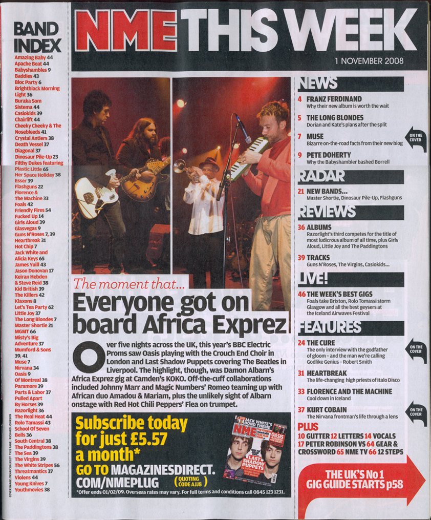
This contents page is structured so that there is a lot going on for the audience to be interested in. The main and only photograph on the contents page is a photograph of a band which are featured in the magazine as being the biggest sell line. Because the picture is the only picture on the contents page, it informs the reader that this band are going to be featured in the rest of the magazine. The list at the left side is a list of other bands that are also featured in the magazine. It is good to have this list because it informs the audience of other bands that feature in the magazine. If someone reads the list and notices that one of their favourite bands is mentioned, they are more likely to buy the magazine. Having the same three colours, red, grey and black make the layout look more professional. However, at the bottom, there is an advertisement to subscribe to the magazine monthly. This text is yellow and therefore stands out from the rest of the colours on the contents page. Because the background is very light grey, a black box has been placed around this advertisement so it is easy to read. The biggest text on the page is 'NME this week.' This is so the reader is fully aware that this is NME magazine, and that the following information is in this weeks magazine. This also has a black box around it to stand out from the rest of the page. The actual text of the contents page is at the right side. There are subheadings which are bold with a black box so that it is clear to the audience what is going to appear in the magazine. Under the subheadings are the page numbers and titles.
Thursday, 15 November 2012
Contents Page 1 Analysis

The contents page
is structured so that there are photographs of the main stories and headlines
of the magazine. The biggest picture on the contents page shows a band member,
and what page of the magazine he is on. He is one of the main sell lines because
his picture is bigger than the others. There are other pictures of other bands
and their page numbers and they are surrounding the main picture, which
suggests that they aren’t as important as the main picture. The contents page
has the same three colours, black, yellow and white. The important text is
written in yellow, and has a black background to make it stand out. Any other
text is written in black. These colours have been used in this way because
black and yellow go well together and these colours stand out and are easy to
read. At the top of the page, the title ‘contents’ is the biggest text on the
page, and this is because it is important that the reader knows that this is
the contents page. Under the contents title, there is the issue number and
date. This text is written quite small because although it is necessary information,
it is not really important to the reader. I think that this is a good contents
page because it is easy for the reader to see, and the information is clear.
Monday, 12 November 2012
Progress Review
So far I have analysed magazine covers and I have wrote about how they attract the audiences attention. I have also finished my first draft and I have received feedback from Kaye and my class on how to improve it. The feedback I received was mostly positive, with some comments telling me how to improve, for example, having clearer pictures. The positive feedback included my use of colour, and the style of text that I had used. I took this feedback into consideration and it helped me to improve my magazine cover. For the past few weeks I have been making the draft of my contents page. This morning I am hoping to complete the first draft and upload it to my blog. When I complete my contents page, I will then receive more feedback next lesson for how I can improve it.
Friday, 2 November 2012
Feedback

This is feedback that I got from my classmates for my first draft of my magazine front cover. The feedback was good overall, however some comments said that I could improve by using different and more professional looking fonts.
Thursday, 1 November 2012
Time Management
This week I have completed my music magazine front cover. Personally I think that my time management was good because I have completed it within the time given and the time that I expected to finish. The task was time consuming and I managed my time well so that I did the things I needed to do.
Magazine cover draft

This is my finished magazine front cover. I have used my own image and I have also come up with my own title for my magazine. The colour scheme of this front cover is black, white and red because personally I think these colours go well together, and the white and red text stands out on the black background. I have also used more of my own images to advertise other interviews and such in my magazine. I have included a bar-code, issue number, and the date as these are all vital things that need to be included on a magazine front cover. I have completed my front page in the time that I was given, and my time management for this task is good. I plan on starting my contents page next lesson.
Subscribe to:
Comments (Atom)